Mapcreator’s default map styles for all your mapping needs
Whether you just need a simple map or you’re aiming for something with a bit more personality, Mapcreator’s built-in styles are a great place to start. They give you a solid base to bring your ideas to life.

In addition to custom work, we offer a selection of ready-made map styles. You can use them as they are or take inspiration from them to shape your custom style. We have recently updated our collection of default styles and are excited to share them with you. In this article, we take a closer look at each default map style and how it serves different purposes.
Classic map style
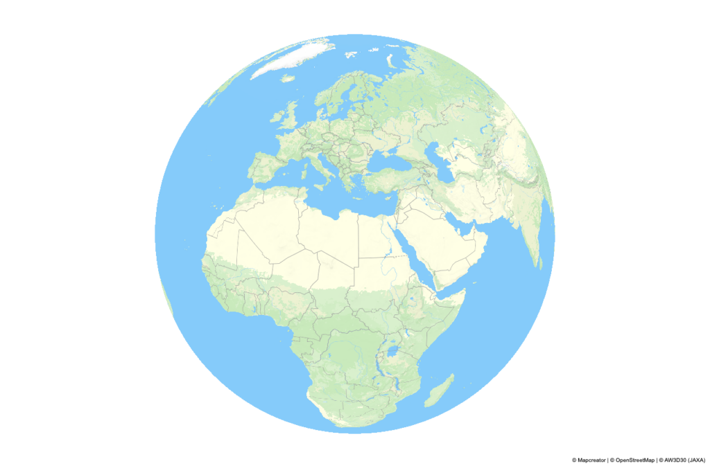
The first map style in our default map styles collection is the evergreen Classic. Its fresh and clean design makes it a great fit for almost any use. Classic style strikes a balance, offering detail without noise:
- It uses detailed land cover data to create a smooth gradient across natural zones — from forests to wetlands, croplands to barrens. The variety of landscapes is easily recognizable, with the Classic palette being self-explanatory.
- Roads are color-coded by class, forming a well-defined hierarchy. The map’s clarity is further enhanced by displaying only generalized roads up to zoom 10.
- Our unique algorithm displays only the largest rivers at low zoom levels, gradually revealing smaller rivers as you zoom in, reducing density while preserving accuracy.
- POI icons are colored per category: teal for entertainment, gray for services and institutions, and red for healthcare. You will find these colors familiar, as they are widely adopted by map apps.
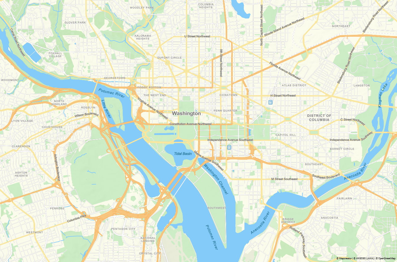
Gray map style
This style is one of our users’ favorites. Think of it as the white T-shirt of map styles: timeless, practical, and it works with anything. Gray offers a light, minimalist canvas:
- Perfect for emphasizing key elements, whether you want to add a bright route or one of our live data layers. It complements the map’s informative elements, letting them stand out.
- Despite its low-contrast palette, the map style remains clear. This is due to the increased road width and adjusted shades, which keep visual elements distinct.
- This map style is often used for data vizualisations, making added elements stand out on the blank map.
Like our other styles, it includes all our latest improvements, so even if it is just a neutral background, it is accurate and up to date.

Dark map style
The dark palette is often chosen for stylistic reasons or to match a particular context. It fits dark interfaces, can emphasize elegance, and often aligns better with brand colors. It is also commonly used in investigative journalism and for serious topics, where bright colors would feel out of place.
To meet these various needs, we designed this style to be both highly detailed and flexible. You can turn layers on or off as needed. At the same time, the style avoids visual clutter by distributing detail across zoom levels — for example, labels appear at later zooms than usual.
Creating a dark map comes with challenges: too much contrast makes them hard to read, while too little can cause elements to blend together. To strike the right balance:
- We added an extra shade, deep green, to better structure the map.
- Labels use intuitive colors: blue for water, green for parks, and regional names match the color of boundaries.
- Roads are differentiated by brightness and adjusted with color interpolation to work well across zoom levels.
- We also used more suitable shades for road numbers, transport stations, and other icons.
This way, we created a clear map without sacrificing any layers.


TV map style
Broadcast maps are often shown on screen for just a few seconds, so they are meant to communicate a message instantly. At the same time, the design process needs to be quick and responsive. We kept these factors in mind when developing the TV map style:
- Clarity is key, so you will note this style is less detailed than others. We introduced new, simplified water data.
- Unnecessary layers were removed, and the number of labels was reduced.
- The landcover base was replaced with an elevation layer to keep the map clean while still conveying depth.
- High-contrast colors, bold fonts, large icons and labels ensure the map remains readable when recorded on screen in the studio.
- TV maps are typically precise at city-level zoom, but become more generalized when zoomed out. In fast-paced production, there is no time to manually adjust the visibility of the elements. So we automated layer appearance.
- Rivers, parks, and roads are interpolated for smooth transitions. City names stay aligned with their icons to avoid flickering during animation.
We also made adjustments for typical use cases. For example:
- A separate layer for state capitals supports regional news.
- Regional boundaries appear only when the entire country is visible.
- The road name layer was split into several levels, so only relevant street labels are shown.
TV maps are often created in our Locator tool for the quickest workflow, so all elements were adjusted to look equally good in both Mapcreator and Locator.


Tourism map style
This style is another example of how a map can support your goal. In this case, the aim is to inspire travel and make a tour offer more inviting:
- We added a depth effect to water, which makes cruise maps more dynamic and enhances the appeal of islands and coastal cities. When diving is part of the trip, bathymetry becomes not just decorative but also informative.
- Soft sandy tones and hillshading add warmth, while the names of mountain ranges and island groups create a sense of exploration. This nod to traditional travel maps invites users to examine the map closely and discover natural hidden gems.
- Tourist maps tend to be minimalistic on the country level, so we kept this scale clean. At the city level, key elements for navigation are included: landmarks, parks, and transport stations.
- All elements are styled in pastel tones, allowing your custom routes and labels to stand out clearly. Despite its detail, the style stays visually balanced.


Newspaper map style
Printed maps still play an essential role in various industries such as news, travel, and real estate, and this style was designed specifically with this in mind.
It features many layers enabled by default, a higher density of map elements, and smaller font sizes. Since printed maps are meant for careful reading rather than quick reference, detail is prioritized over simplicity.
We also introduced special design touches, including:
- Outer strokes for country boundaries.
- Distinct line styles depending on the type of boundary.
- Light fonts to fit more information on the map while keeping it clear.
Each zoom level is thoughtfully designed to support storytelling. At low zoom, the map stays minimalistic. At medium zoom, regional borders and names are added. As you zoom further in, the map shifts to brighter colors and more details, making locations easy to recognize even from a small section of the map.


Real estate map style
A real estate map is a schematic overview of a location’s key features and benefits. It should offer a vivid sense of life or work in the area, even to someone who has never been there. To create that impression:
- We added a default 3D building effect. As you zoom in and tilt, the cityscape emerges, allowing users to “walk through” the area.
- We updated the POIs to include amenities like restaurants, shops, banks, recycling centers, fitness clubs, and more. Initially, only icons appear; names are revealed at closer zoom levels to preserve clarity. The icons are self-explanatory, so the map remains clear.
- Transport accessibility is one of the key priorities in real estate. We emphasized road hierarchy using darker shades and added road markings to major roads for better visibility. Bicycle lanes are highlighted in red, complete with markings. Transport stations, railways, and parking areas were enabled.
- We interpolated city names: they start small and grow larger as you zoom in, creating a poster-like look.
As a result, we have created a style that specializes in the city or neighborhood scale. We can’t guarantee higher property values, but we can make the map look good enough to tempt a move.


Want to go custom?
Whether your vision involves pastel trails or grayscale subway systems, we’re all ears. Send us a detailed design brief or just share your preferences — we will be happy to create a map style that aligns with your goals and matches your brand. For ideas, feel free to explore the Gallery of maps created by our users.
Don't forget to share this post!
Deeper understanding of maps
For mapping tips, updates, and deep dives for the cartographically curious.
Choropleth maps in Mapcreator just got easier
A choropleth map is a color-coded map that shows how values differ between geographic areas, such as countries, regions, or...
Read more
Why bringing your own data can make for better maps
Some maps do not begin as maps. They begin as bits and pieces of information waiting to make sense together....
Read more
Your 2026 Winter Olympics maps are here!
Italy is getting ready for the 2026 Winter Olympics. Snow, ice, roaring crowds, and at least one person asking if...
Read more
New! Render Globe Maps as Vector Files
We don't like world maps. There, we said it. Most world maps you come across are distorted. When you flatten...
Read moreImport a spreadsheet with automatically numbered icons
If you’re manually placing numbered icons one by one onto a map, stop right there; we need to have a...
Read more
Create isolated country shape maps in Adobe Illustrator
A clear and focused map conveys a story faster than a thousand words. Isolated country maps, where just one area...
Read more