Why bringing your own data can make for better maps
Some maps do not begin as maps. They begin as bits and pieces of information waiting to make sense together. They start in spreadsheets, route files, design folders, exports, downloads, and sometimes in a file name that has seen far too many versions of the word “final”.
Useful, yes. Map-ready? Not always.
Eventually, that data needs to become a visual. A list of locations needs to become map points. A boundary needs to appear in the right place. A logo, icon, or image needs to become part of the final design. That is where importing comes in!
With Mapcreator, you can bring your own files directly into your map. No complicated detours. No rebuilding everything from scratch. Just your data on a map, where it belongs.
The power of a map
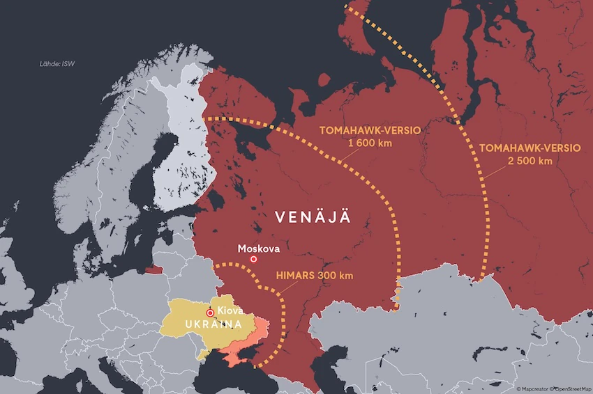
Take a look at the map below. Do you speak Finnish? Maybe not. But with the right colors, points, routes, or highlighted areas, you can still understand what a map is trying to communicate. That is the strength of data visualization on a map. It gives information a shape, makes patterns easier to spot, and helps your story travel beyond language.
When your spreadsheet needs a map
Spreadsheets are useful, until you need to see where everything actually is.
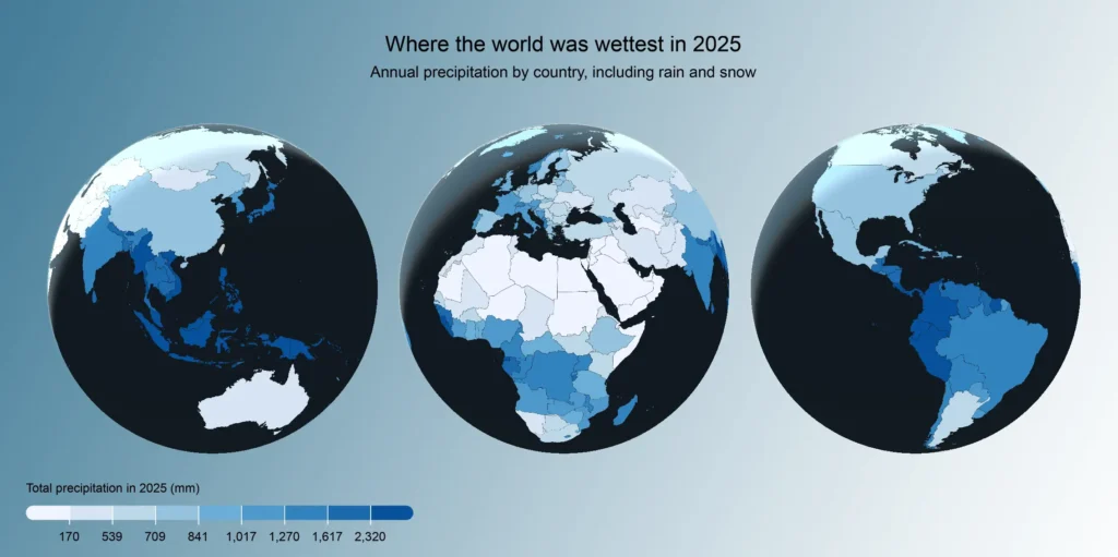
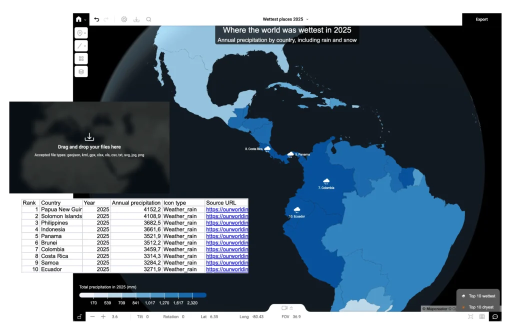
A long list of addresses, offices, venues, customers, shops, or delivery points can tell you a lot. But once you import that spreadsheet into Mapcreator, those rows of data become clear map points. Suddenly, you are not just looking at a list anymore. You are seeing distance, density, clusters, gaps, and patterns. Before you import anything, it helps to know what you want those rows to become. Do you want to place markers for specific locations, such as shops, venues, or other location points? Or do you want to highlight areas, such as regions, postal codes, or countries, with a choropleth map?
Mapcreator supports XLSX, XLS, and CSV files. You can use location data in the form of addresses or coordinates. You can even add icon names to your spreadsheet, and Mapcreator will place the right icons automagically.
For choropleth maps, Mapcreator helps match your spreadsheet data to the right areas. If something cannot be matched right away, it is highlighted before you import, so you can check unidentified areas and connect them manually where needed. Your spreadsheet can also carry more than just location data. You can add columns to use for data binding, think of labels, videos, images, URLs or email addresses. Sometimes a point on a map is not just a point. It is a place with context, and it deserves to be shown that way.
When the file already exists somewhere else
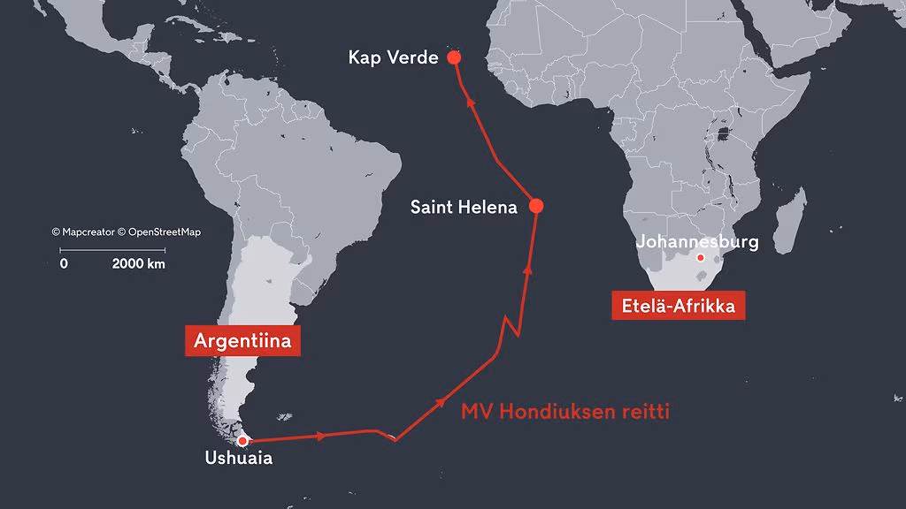
Not every import starts with a spreadsheet. Routes, regions, service areas, travel paths, and custom shapes often already exist in formats like KML, GPX, or GeoJSON. Instead of recreating them, you can bring those files straight into Mapcreator.
That means you can continue working with existing data visually. A hiking route, an impact zone, a disputed boundary, a flight path; if it helps explain the story, it belongs on your map.
Once imported, you can adjust the styling, including the color and stroke, so the shape or route fits naturally with the rest of your map.
Upload icons, logos and images to your map
Maps are not just about data. They are also about communication. Sometimes your project might need a custom icon that says more than a generic marker ever could. Mapcreator lets you import image files such as SVG, PNG, and JPG. You can use them as custom icons, logos, branded markers, or other visual elements on your map.
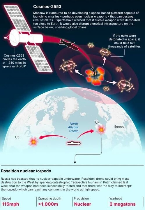
The Daily Mail example below shows how custom icons and visual elements, such as satellites, routes, explosions, or markers, can make a complex story easier to understand at a glance. By importing your own icons and images, you can give your map the same kind of story-specific visual language.
Your map, your data
Importing your own data into Mapcreator is about making it understandable at first glance. The spreadsheet. The route. The boundary. The logo. The little details that turn a map from a basic element into a story.
And just like the Finnish map example we started with, the right map can make things clear even when the words are not. That is the power of bringing your own data into your mapping project! And really, the superpower of every good map.
Don't forget to share this post!
Deeper understanding of maps
For mapping tips, updates, and deep dives for the cartographically curious.
Choropleth maps in Mapcreator just got easier
A choropleth map is a color-coded map that shows how values differ between geographic areas, such as countries, regions, or...
Read more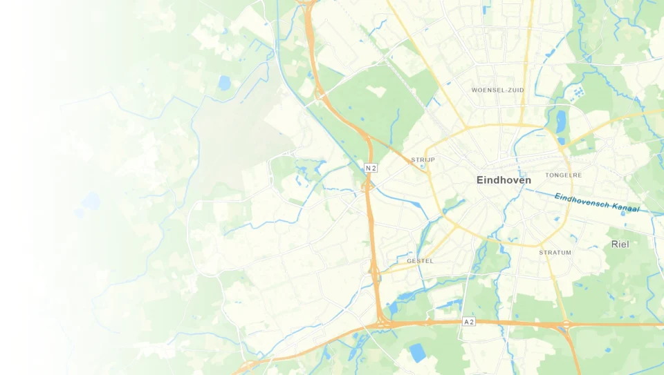
We just do maps. And that’s the point.
A good map often looks effortless, and that’s the whole point. But behind that simplicity are countless cartographic choices, design...
Read more
What the 30 Day Map Challenge taught us about creativity (and Mapcreator)
Every November, cartographers, designers, and data nerds gather around the same global campfire: the 30 Day Map Challenge. The rules...
Read more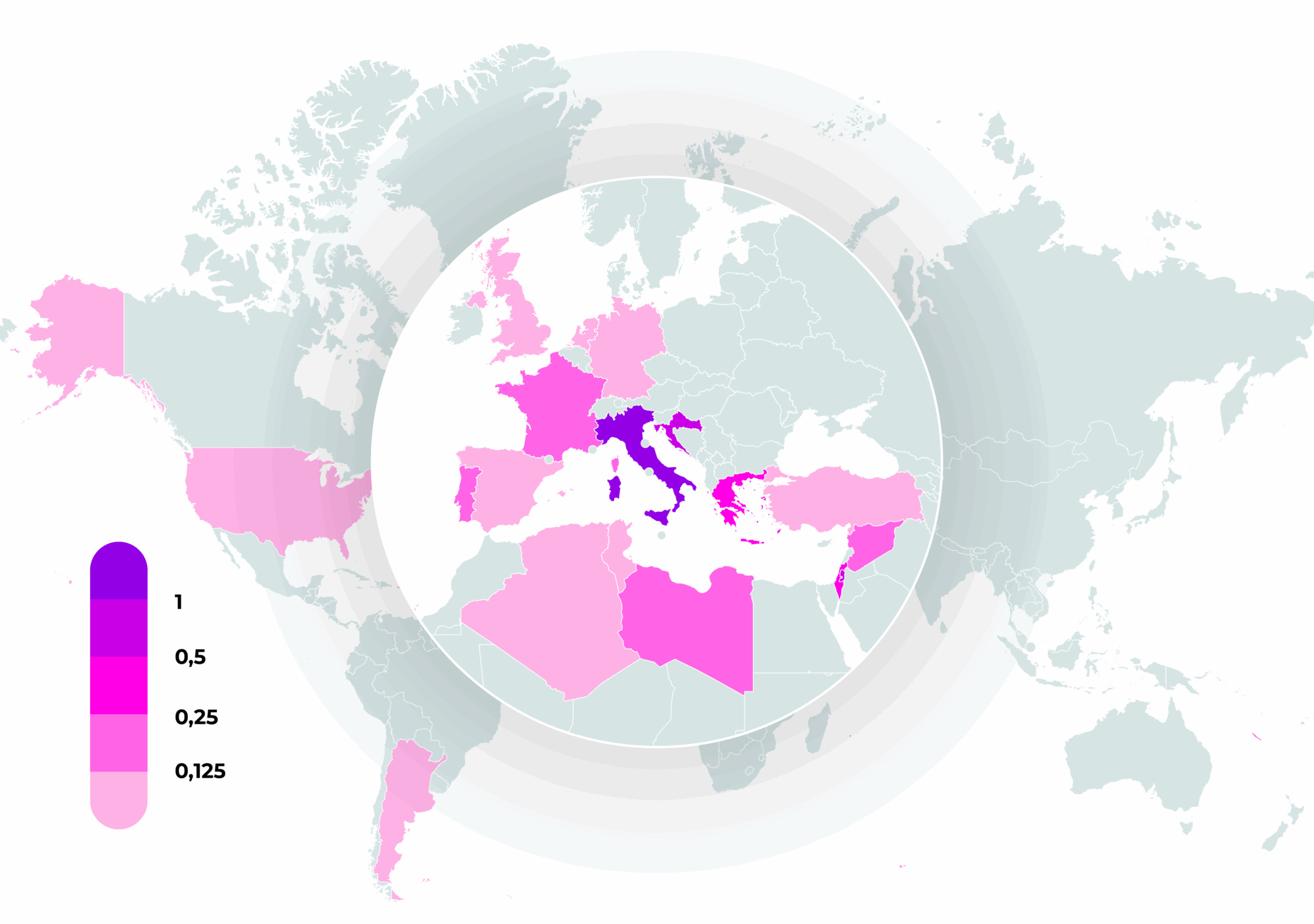
How static, interactive, and animated maps win hearts (and clicks)
There’s a lot of competition for attention out there. Cat videos, doomscrolling, the latest season of [enter your favorite season...
Read more
Your 2026 Winter Olympics maps are here!
Italy is getting ready for the 2026 Winter Olympics. Snow, ice, roaring crowds, and at least one person asking if...
Read more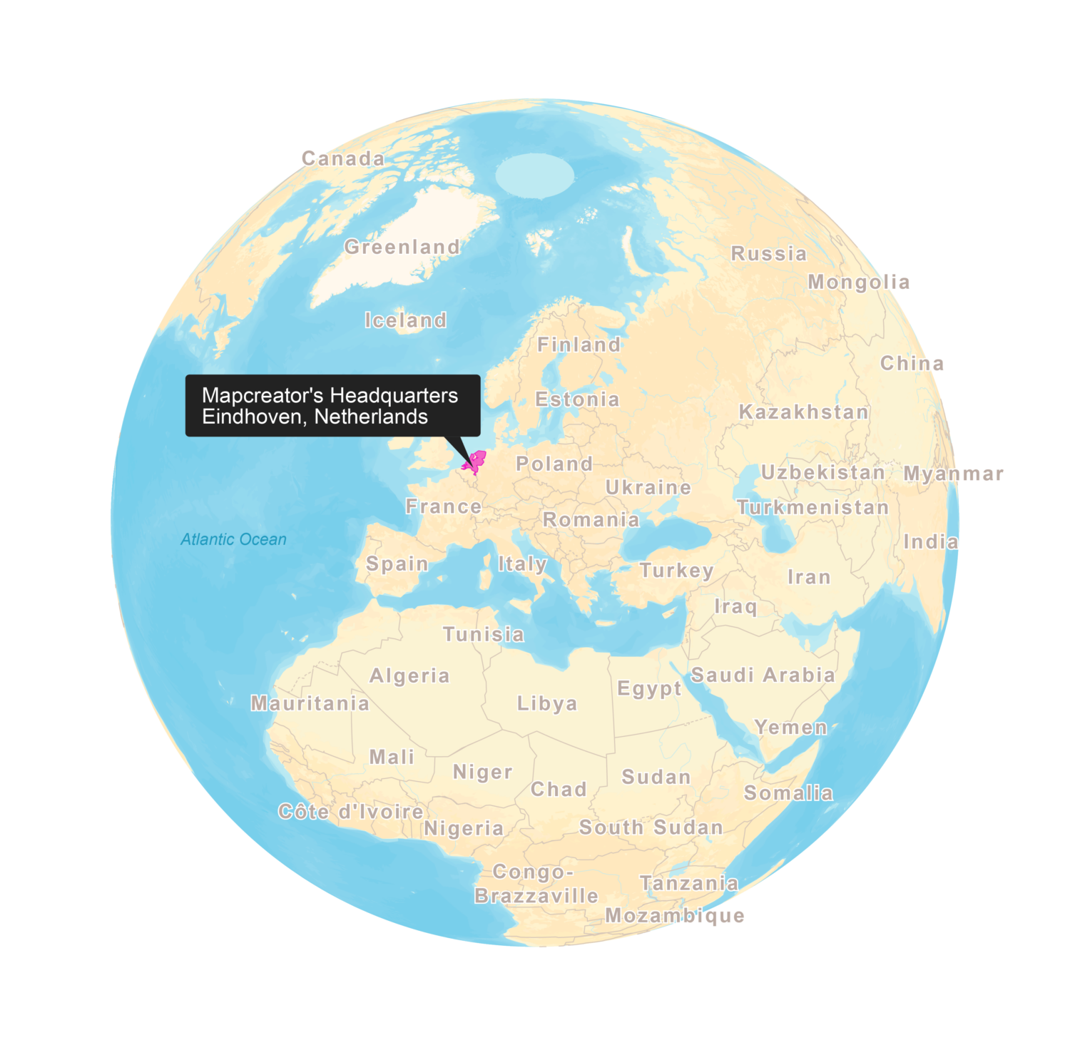
New! Render Globe Maps as Vector Files
We don't like world maps. There, we said it. Most world maps you come across are distorted. When you flatten...
Read more