Stay ahead with live data visualizations
Keep your maps current with live data layers that update automatically. From wildfires and hurricanes to droughts and elections, Mapcreator’s live overlays let you visualize change as it happens. Whether embedded on your website, used in broadcast, or exported as an animation, your maps always show the latest data.
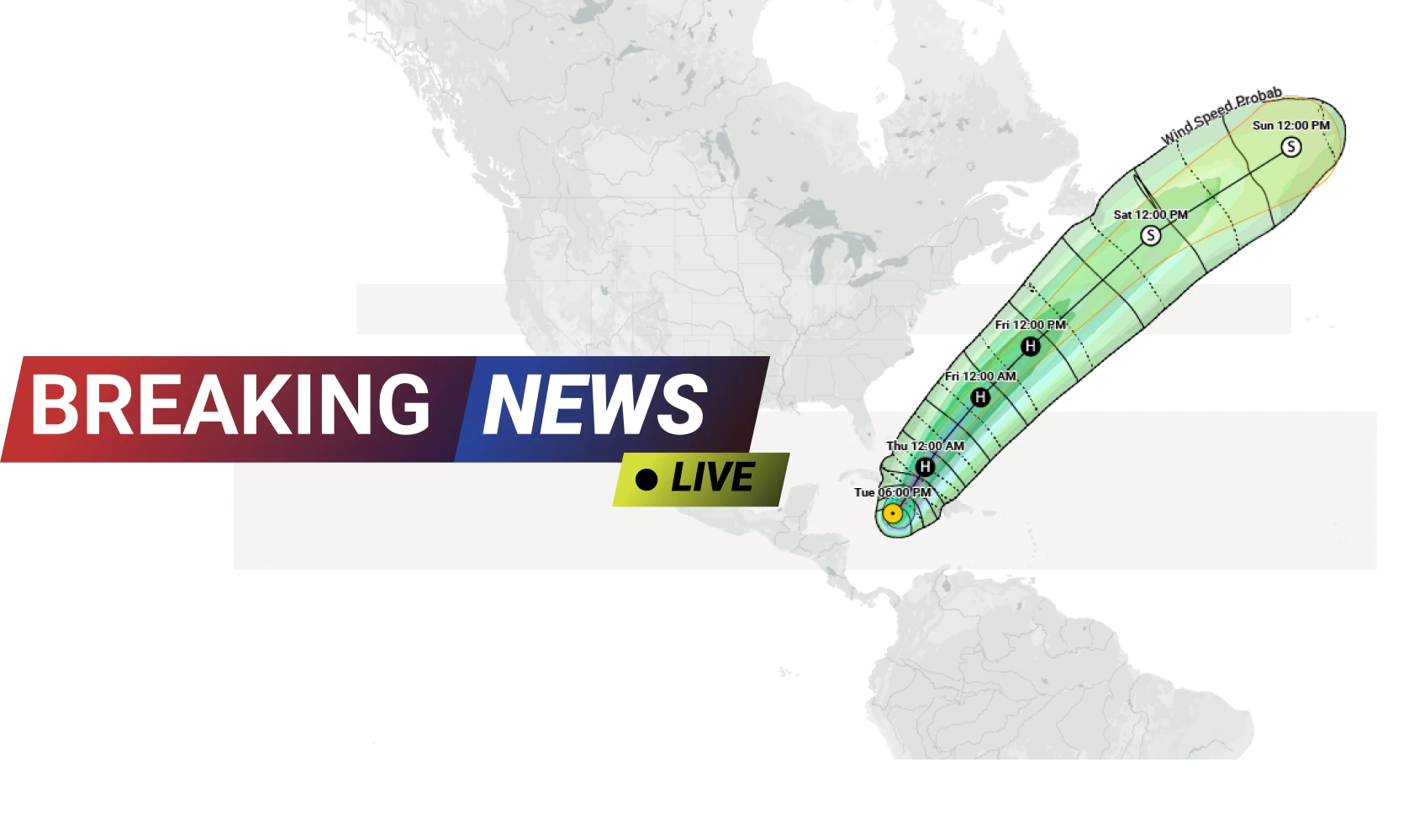









Natural events
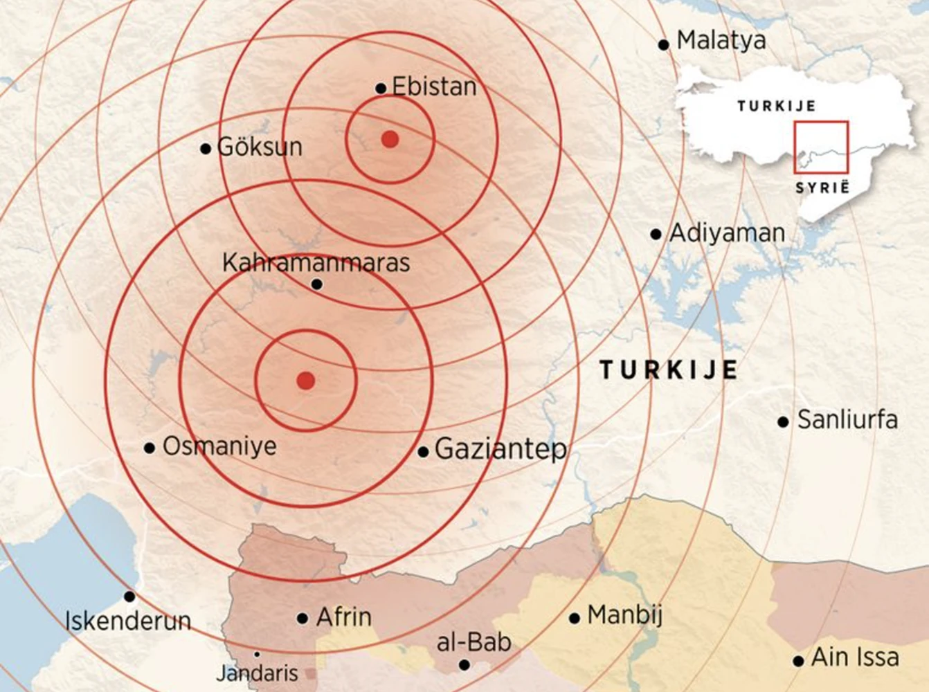
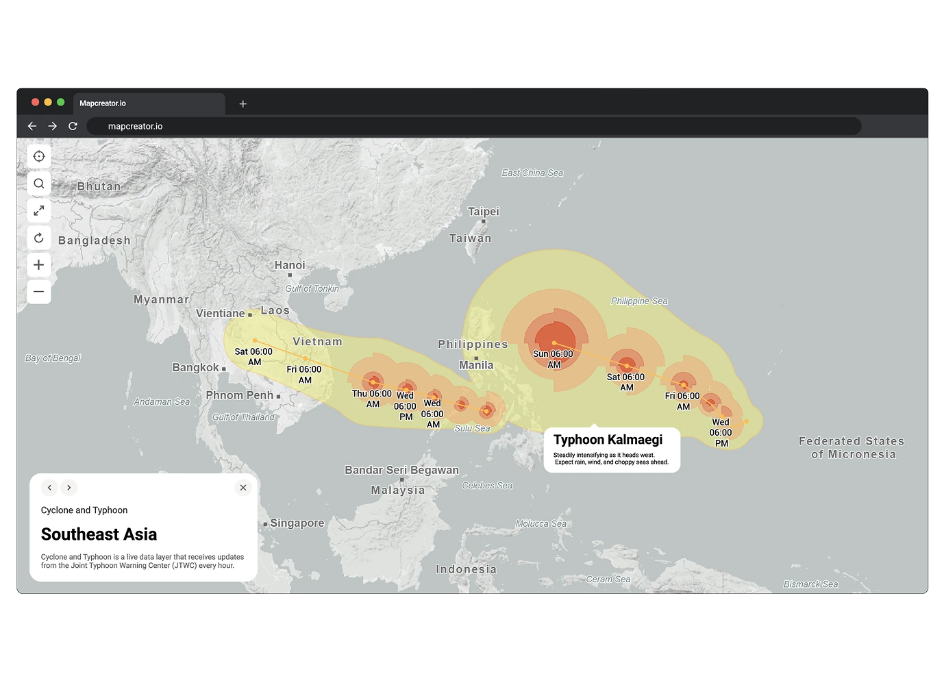
Follow live data from trusted global sources including the USGS, NOAA, and NRCAN. Visualize hurricanes, earthquakes, wildfires, and droughts with clear, color-coded layers that refresh automatically. Each dataset includes detailed attributes like magnitude, wind speed, or fire perimeter, helping you convey both scope and impact. Perfect for broadcast, newsrooms, researchers, and emergency communication.
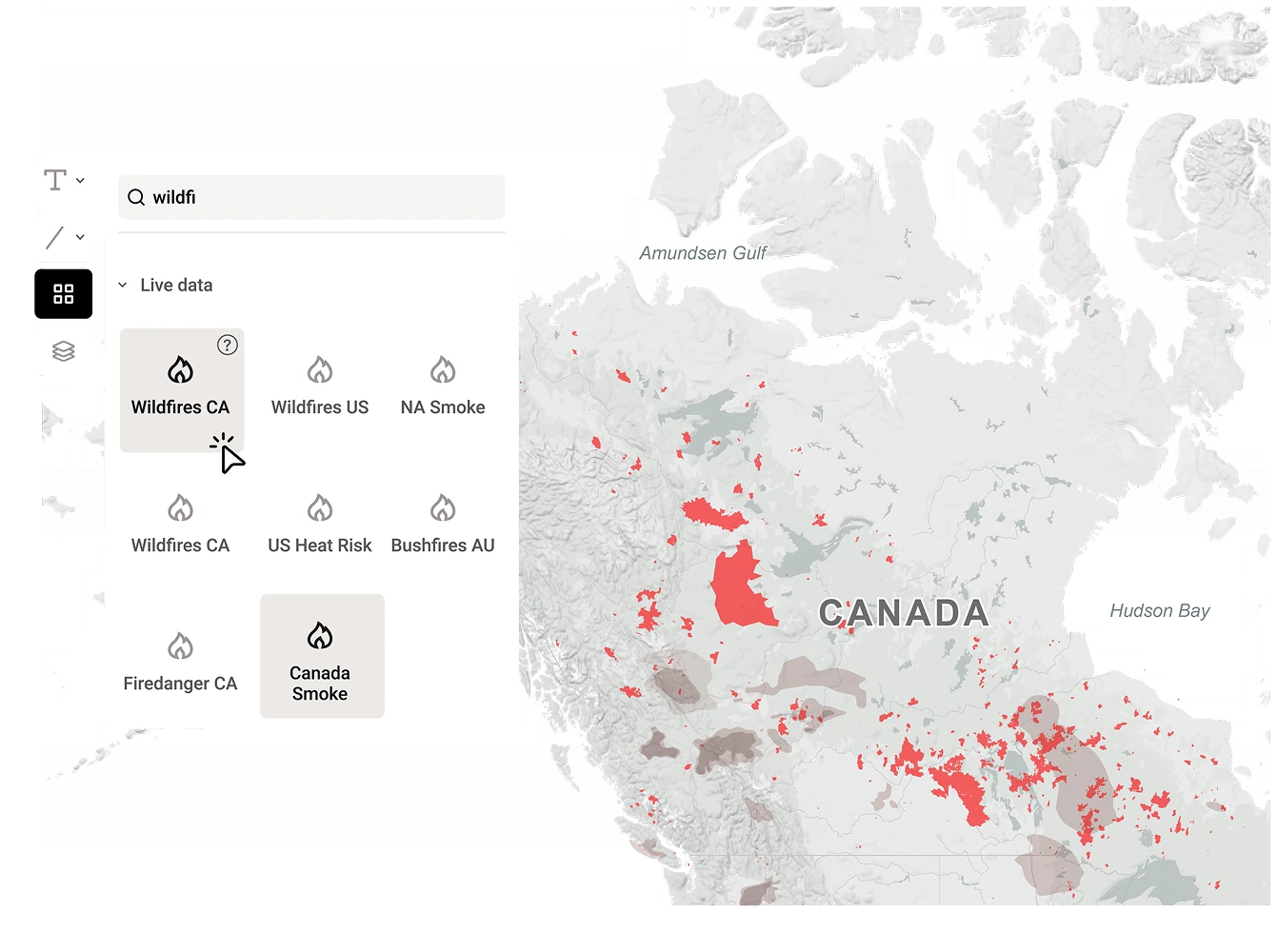
Environmental insights
Mapcreator’s live data layers also include heat risk, smoke distribution, and fire danger levels across North America and beyond. Updated hourly or daily, these layers make complex environmental changes easy to communicate at a glance. Embed interactive maps on your website to keep your audience informed, or export visuals for print and animations for broadcast.
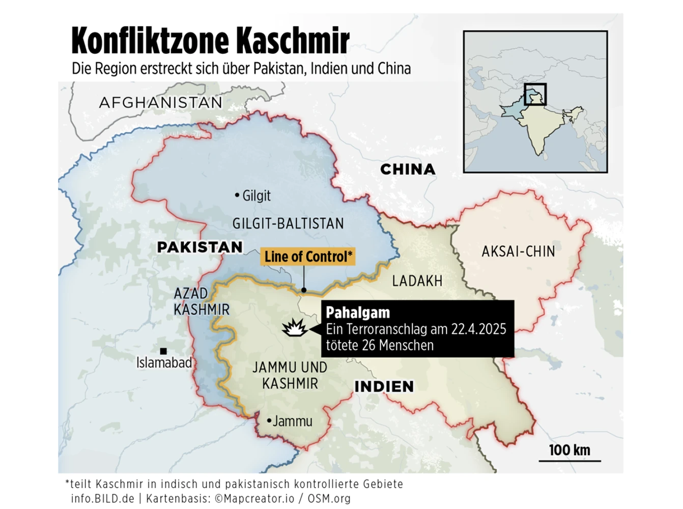
Conflict and humanitarian coverage
Visualize changing territorial control, humanitarian risks, and conflict zones with automatically updating data layers. Use the Russo-Ukrainian War live layer to follow territorial changes in real time, or use the Kashmir Conflict or Disputed Borders overlays to provide essential geopolitical context. Our integrations pull verified information from trusted partners, helping newsrooms and analysts show accurate, evolving maps of major global events.
Election coverage
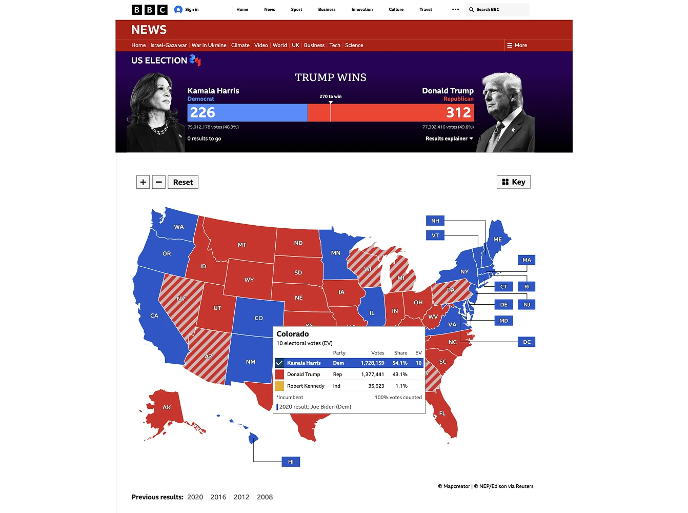
Display live election results using trusted data sources or your own feeds. Regions update automatically in your color scheme, while labels and pop-ups highlight key races. Mapcreator’s election maps have powered major broadcasts worldwide — from the U.S. and Canadian elections to regional coverage in France and Australia — keeping audiences informed with accurate, real-time visuals.
Interactive updates
Export your project as an iframe to keep your published map synced with its data source. Earthquakes, hurricanes, fires, smoke, and other live overlays automatically refresh according to their update cadence — no manual updates needed. Whenever you reopen a project, it reflects the latest data available. Simply re-export to refresh your static map, or bring your visuals to life with map animations.
Bring your own data
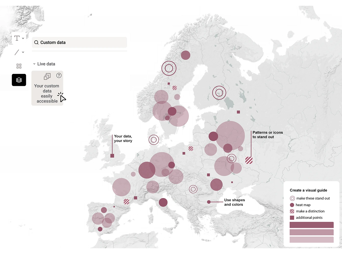
Have your own data source? Our team can turn it into a custom (live) data layer that updates just like the built-in ones. We’ll help you visualize it directly in Mapcreator. Fully integrated, branded, and always current.
Map smarter now.
No spam, just high-quality mapping insights. Unsubscribe anytime.
Frequently asked questions
Got a question? Start with these essential FAQs, or explore our Knowledge Base for more Mapcreator guidance.
What are live data layers in Mapcreator?
Live data layers are map overlays that update automatically from trusted data sources. They can show changing events such as hurricanes, earthquakes, wildfires, smoke, drought, elections, conflict zones, and other real-time developments.
Do published live maps update automatically?
Yes. When you publish a live data map as a web embed or iframe, the map stays synced with its data source and refreshes based on that layer’s update schedule. For static exports, simply reopen or re-export the project to use the latest available data.
Can I use my own live data in Mapcreator?
Yes. If you have your own data source, Mapcreator can help turn it into a custom live data layer. This lets your team visualize proprietary, internal, or partner data directly in Mapcreator with your own styling and branding.
Where can I use live data maps?
You can use live data maps on websites, in broadcast graphics, in interactive storytelling, in reports, or as animated map visuals. They are especially useful for newsrooms, broadcasters, researchers, public organizations, and teams that need to communicate fast-changing location data.