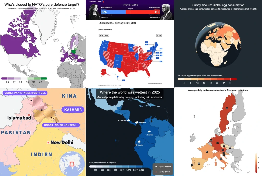
Choropleth maps in Mapcreator just got easier
A choropleth map is a color-coded map that shows how values differ between geographic areas, such as countries, regions, or districts.
Election results, population density, regional sales, risk levels, tourism numbers — when your data is linked to countries, regions, or other areas, a choropleth map helps people understand the pattern faster.
Instead of asking your audience to scan a spreadsheet and interpret the numbers themselves, one glance can reveal a pattern behind your data. And in Mapcreator, creating a choropleth map from a spreadsheet has become a lot smoother!
Create a choropleth map from a spreadsheet
You no longer need to manually color-code every area or wrestle with complicated GIS tools.
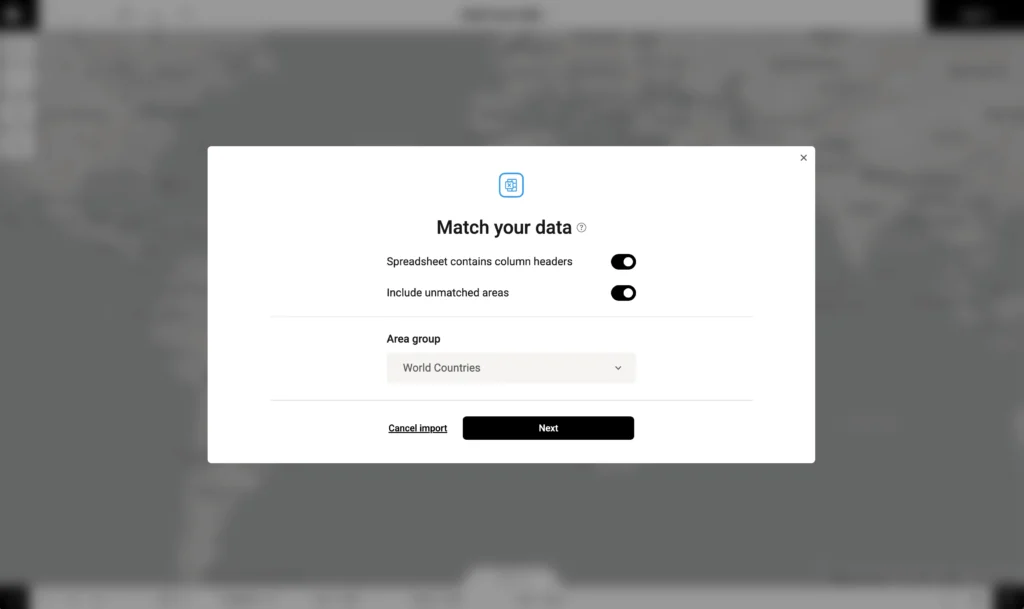
Just drag and drop your data file into Mapcreator, choose which data set and column you want to map, and the tool does the heavy lifting for you. Mapcreator analyzes your file and the location data will get matched automatically, so you can focus on the part that actually shapes the story: the styling.
Once your data is in, you can define data classes, choose color ranges, and fine-tune how the map communicates your numbers.
To make imports even smoother, you can export the base data from Mapcreator first, add your own values, and import it again. Because the area names and structure already match Mapcreator’s data, your file is easier to recognize and map correctly.
Or, as we may or may not have said during testing: drop it like it’s XLSX.
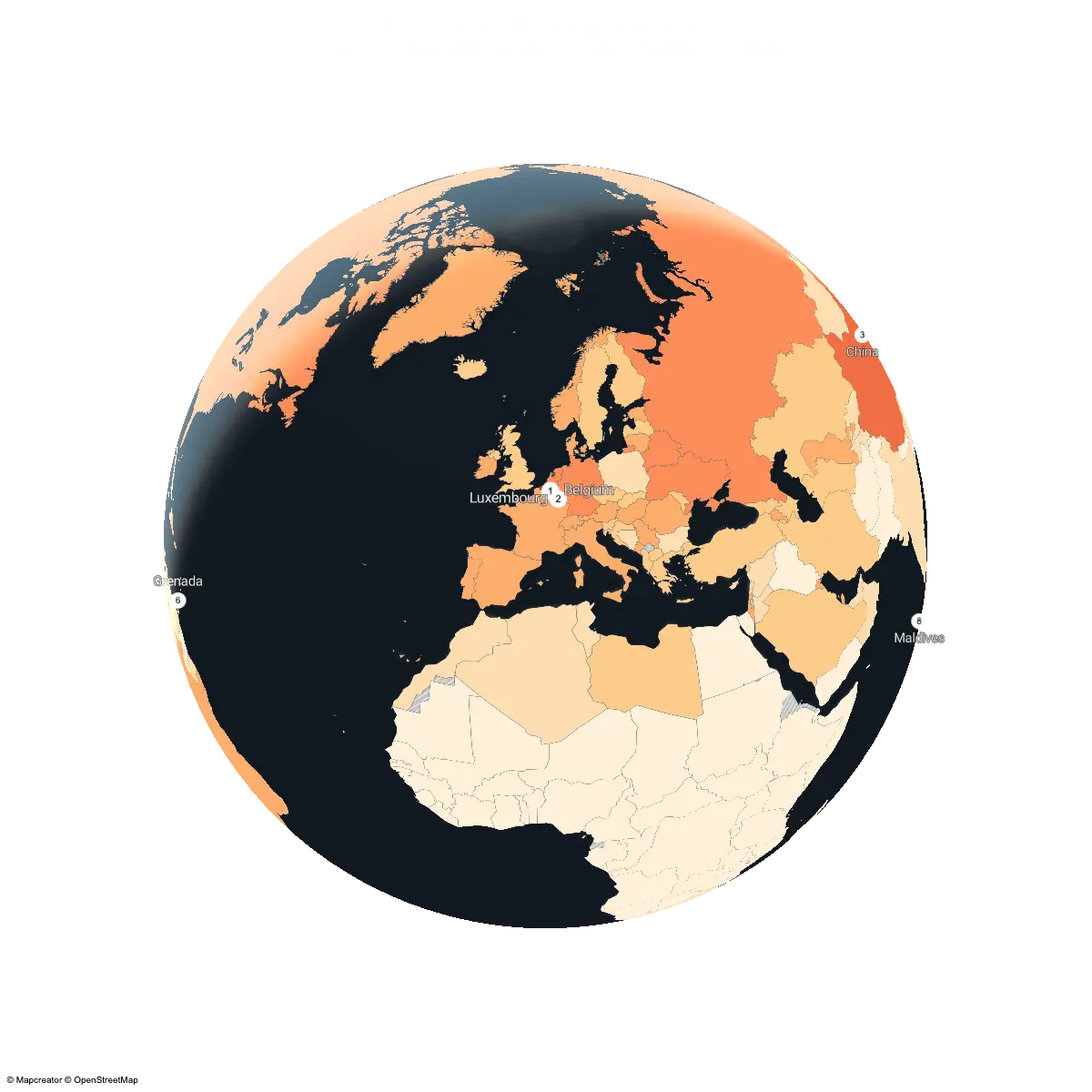
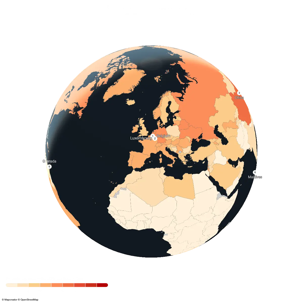
Turning egg data into a global pattern
Let’s make this less abstract. Imagine you have a spreadsheet with average annual egg consumption per person by country, measured in kilograms. A part of that spreadsheet might look like this:
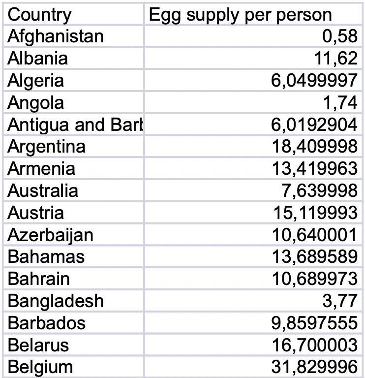
As a table, this data is useful. You can sort it, compare values, and spot the highest numbers if you look closely enough. But it still asks quite a lot from the reader. They need to scan the rows, remember values, compare countries, and build the bigger picture in their head.
A choropleth map does that work much faster.
Once the same data is placed on a world map, the story becomes visible almost immediately. Higher-consuming countries stand out immediately, while lower values fade into lighter shades. But the real value is not just seeing who ranks highest. It is seeing where those places are.
That is what makes choropleth maps so useful. Once mapped, our egg data finally comes out of its shell: no more rows to scan, just patterns to spot.
Color-code your areas with purpose
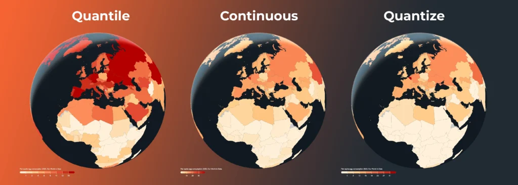
Choropleth maps use color to show differences between areas. But the way you divide and style your data can change how the map is perceived. In Mapcreator, you can style your data in different ways depending on the story you want to tell.
Quantile divides the data so each class contains roughly the same number of areas. This is useful when you want to show relative ranking, such as which countries fall into the lowest, middle, or highest groups compared with the rest of the world.
Quantize divides the data into equal value ranges. This is useful when you want to compare absolute values. In the egg consumption example, it clearly shows which countries are truly at the higher end of the scale.
Continuous uses a smooth color gradient instead of fixed classes. This works well when you want to show gradual differences across the map without creating hard category breaks.
There is no single “best” option. Quantize is useful for clear value ranges, quantile is useful for comparison and ranking, and continuous styling is useful when you want a smoother, more nuanced view of the data.
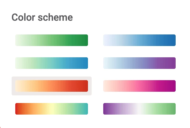
Choosing colors that help tell the story
Color is one of the first things people notice on a map, often before they read the title or legend. That means your color scheme does more than making the map look nice — it helps set the meaning. Some colors already carry meaning. Red and blue are often used for elections, red and green can suggest loss and gain, green feels natural or environmental, and blue often works well for water or calmer analytical maps.
For a dataset like egg consumption, a light-to-dark color scale is a natural choice. Lower values can stay pale, while higher values become stronger and easier to spot. A warmer yellow-to-red scheme can make high-consumption countries stand out immediately, while a softer single-color gradient may feel more subtle and editorial.
Mapcreator offers ready-made color schemes for different types of maps and data stories, so you do not have to build a palette from scratch.
Because in the end, color should do two things at once: look good and make the data easier to understand.
A better legend for clearer maps
A good choropleth map needs a good legend. Without one, your audience is basically being asked to decode a color puzzle. Fun at game nights, less ideal in a report.
That’s where the revamped legend options come in.
With the Legend Overlay, you can clearly explain the colors, icons, and symbols used on your map. Flexible entry settings let you define the shape, color, text, and even font settings, so your legend can match the rest of your map instead of feeling like an afterthought.
From data file to visual story
Upload your data, choose how it should be styled, and connect a legend that makes the result clear.
From election results to world data like global egg consumption, choropleth maps help turn geographic data into an interactive story people can understand at a glance.
Bring the data. Build the story. Let your map do the talking. From a spreadsheet to a choropleth map in minutes!
Don't forget to share this post!
Deeper understanding of maps
For mapping tips, updates, and deep dives for the cartographically curious.
Why bringing your own data can make for better maps
Some maps do not begin as maps. They begin as bits and pieces of information waiting to make sense together....
Read more
Your 2026 Winter Olympics maps are here!
Italy is getting ready for the 2026 Winter Olympics. Snow, ice, roaring crowds, and at least one person asking if...
Read more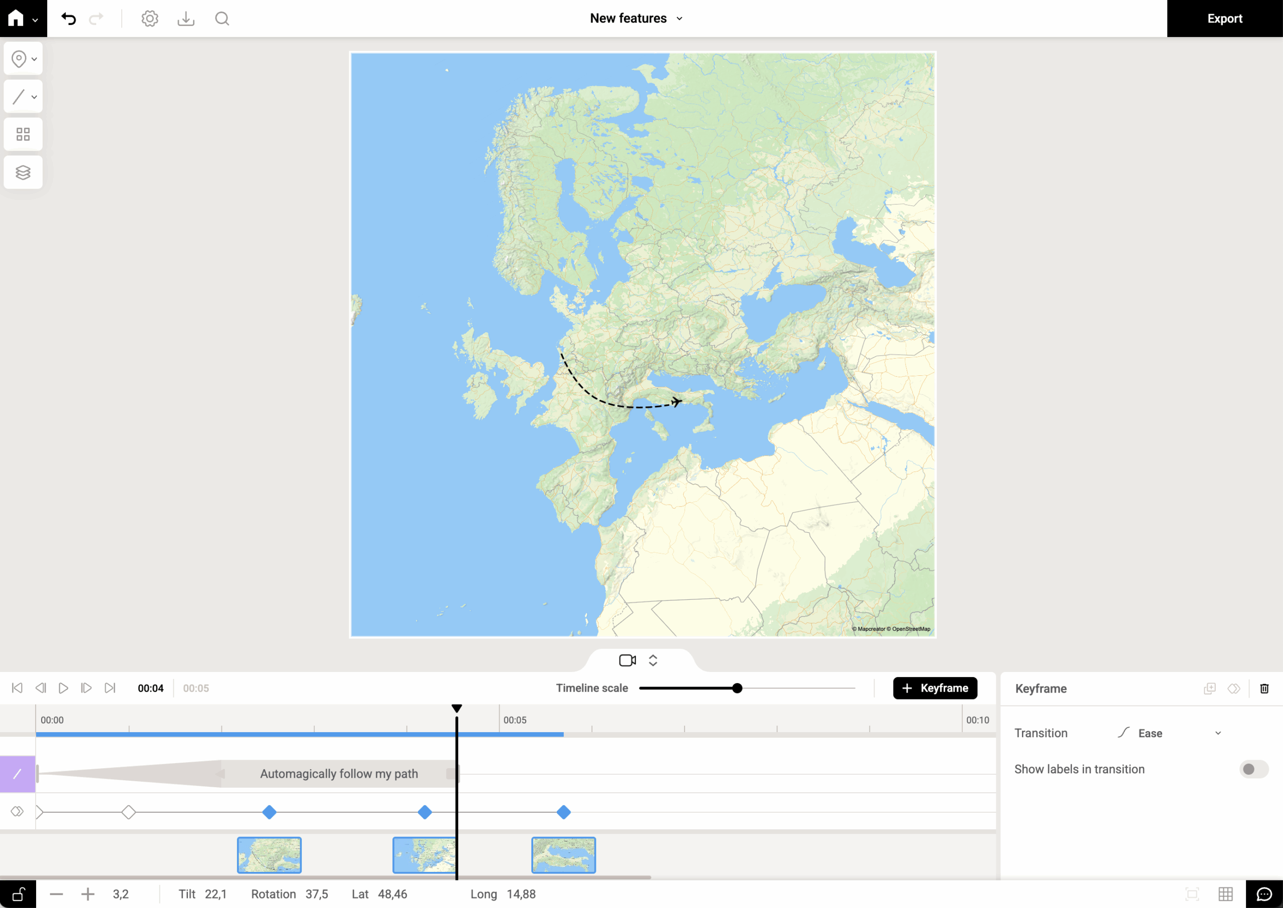
New! Map animations, now on autopilot with auto-keyframe
We’ve all been there: you want to animate a camera smoothly along a winding route (or just from point A...
Read more
New! Render Globe Maps as Vector Files
We don't like world maps. There, we said it. Most world maps you come across are distorted. When you flatten...
Read moreImport a spreadsheet with automatically numbered icons
If you’re manually placing numbered icons one by one onto a map, stop right there; we need to have a...
Read more
Mapcreator's default map styles for all your mapping needs
Whether you just need a simple map or you're aiming for something with a bit more personality, Mapcreator’s built-in styles...
Read more