How static, interactive, and animated maps win hearts (and clicks)
There’s a lot of competition for attention out there. Cat videos, doomscrolling, the latest season of [enter your favorite season here]…So, how do you make sure your data, story, or project doesn’t just get a polite glance before people move on?
Answer: give it a map.
Maps are natural attention magnets. They help us connect information to place, making it instantly more relatable. And the best part? You don’t have to stick to one style. Whether it’s a static, interactive, or animated map, each brings something different to the table (and yes, we love them all equally — like a parent who’s actually telling the truth).
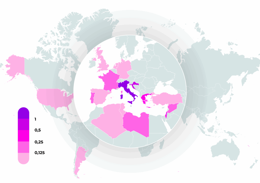
Static maps: The reliable classic
Static maps are like a perfectly tailored suit; they never go out of style. They’re crisp, fast to load, and created in just a few clicks. Need a clean, branded visual for a news report, internal presentation, or (digital) article? From quick locator maps to highly detailed visualizations, Mapcreator’s true vector maps will not let you down.
Offering a PDF with CMYK colors for print-ready graphics or SVG for digital publishing, with Mapcreator’s customization features, you can match colors to your brand, add annotations, and highlight exactly what matters. They’re perfect for that first “aha” moment when clarity is key.
Did you know:
- Static maps can deliver nearly 90% of the key information within the first 10 seconds, with 75% retention after 24 hours—making them unbeatable for instant comprehension (Map Library, 2025).
- Simple static visuals can also improve comprehension and decision-making for non-technical audiences, reducing cognitive load while keeping the focus on the key message (ScienceDirect, 2023).
- Using SVG files can reduce webpage load times, a critical factor in user engagement and conversion rates—e-commerce platforms that integrate SVGs tend to experience notably lower bounce rates and higher engagement metrics, as faster visuals help users stay and interact more (Wallpapers, 2024).
- Static maps are delivered as lightweight, pre-rendered images, while interactive maps require downloading large JavaScript libraries and performing continuous client-side rendering, increasing both load time and CPU usage (Map Library, 2025; Dito, 2025).
Sometimes, less is more — especially when you want your audience to understand and remember your story long after they’ve closed the tab.
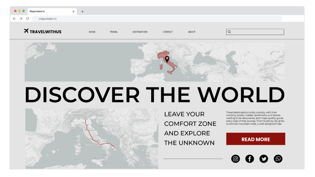
Interactive maps: The conversation starter
Recent studies back it up:
- 2 times more engagement compared to static visuals (Amra & Elma, 2025).
- 2.5 times higher user interaction in public-sector data projects (Moldstud, 2024).
- Users feel more in control of data exploration, which increases both understanding and time spent engaging (Syracuse iSchool, 2025).
Interactive maps take your audience a step further. They invite your audience to zoom, pan, hover, and click — uncovering details you’ve placed for them to find.
Interactive maps transform passive viewers into active explorers. They keep people on your page longer, encourage curiosity, and (bonus) make your analytics look really, really happy.
Animated maps: The storyteller
- Map animations enhance the comprehension of complex geographic trends and evolving data, making for better geospatial understanding (MDPI, 2024).
- In experiments with cartograms, adding animation made high-level analyses much more accurate, especially when viewers needed to compare or detect large patterns (Arxiv, 2020).
- For simpler animated route maps, participants achieve 98% recall accuracy (MDPI, 2021). What other proof of engagement do you need?
But there is more:
High-quality graphics, including dynamic maps, can double audience engagement, improving both retention and trust (Ross, 2024).
Animated maps add the dimension of time to your data. This is perfect for showing how things change, move, or grow. Whether it’s tracking flightlines or following bike trails, moving through 3D terrain, or seeing the London Eye from every angle.
By adding movement, you tap into our natural instinct to follow the action. It’s a subtle nudge that says: don’t look away just yet: something’s happening here. And it works! Animated visualizations are proven to improve comprehension for complex, time-based data (Arxiv, 2020).
Why use just one when you can have all three?
Static maps for the instant overview.
Interactive maps for deeper dives.
Animated maps for the full cinematic experience.
And if you’re wondering whether it’s worth the effort, the evidence says yes:
- Maps help people make sense of spatial data more intuitively (ScienceDirect, 2021).
- In expert use, multi-layered interactive maps improved insight generation and analysis speed (MDPI, 2023).
With Mapcreator, you can start anywhere: static, interactive, or animated, and scale your map’s engagement potential based on your story. Whether you’re aiming for a quick overview or a deep-dive experience, you’ll have the tools to make your audience stick around, click around, and come back for more.
Because in the battle for attention, a good map is worth a thousand words… and at least a few extra minutes on your page. Remember: a map isn’t just a pretty picture. It’s your secret weapon for clarity, engagement and information!

Don't forget to share this post!
Deeper understanding of maps
For mapping tips, updates, and deep dives for the cartographically curious.
We just do maps. And that’s the point.
A good map often looks effortless, and that’s the whole point. But behind that simplicity are countless cartographic choices, design...
Read more
Why bringing your own data can make for better maps
Some maps do not begin as maps. They begin as bits and pieces of information waiting to make sense together....
Read more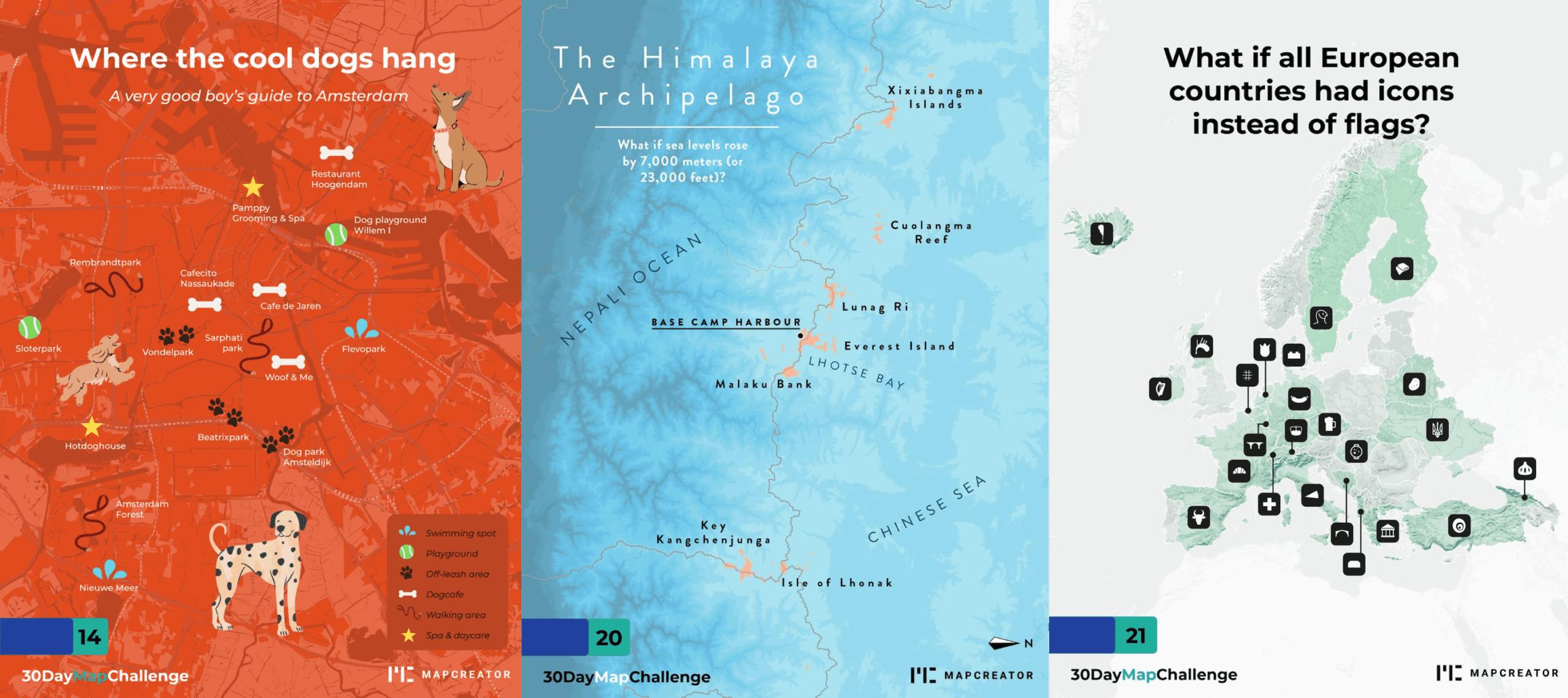
What the 30 Day Map Challenge taught us about creativity (and Mapcreator)
Every November, cartographers, designers, and data nerds gather around the same global campfire: the 30 Day Map Challenge. The rules...
Read more
3D Terrain — Take your mapping projects to new heights
Are you ready to take your map animations to a whole new level? Get ready to elevate your mapping projects...
Read more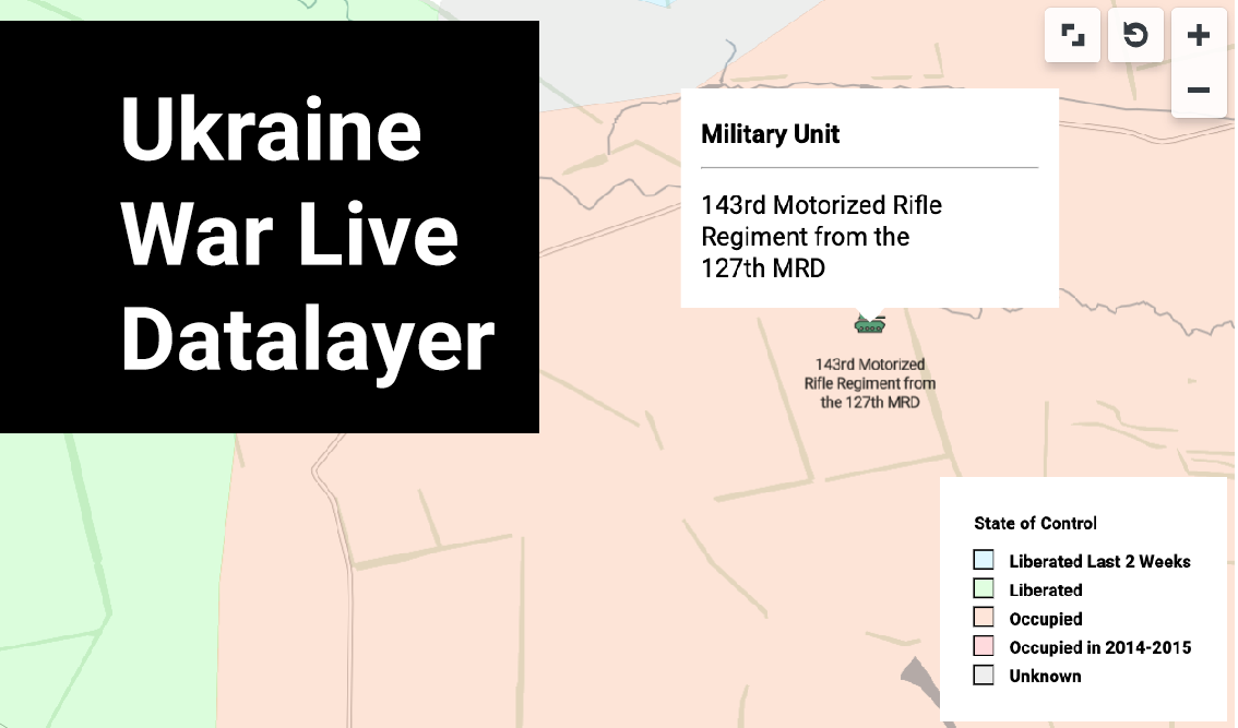
Visualize the Ukraine War: Explore the new live data layer
Covering the war in Ukraine is of paramount importance as it sheds light on one of the most critical geopolitical...
Read more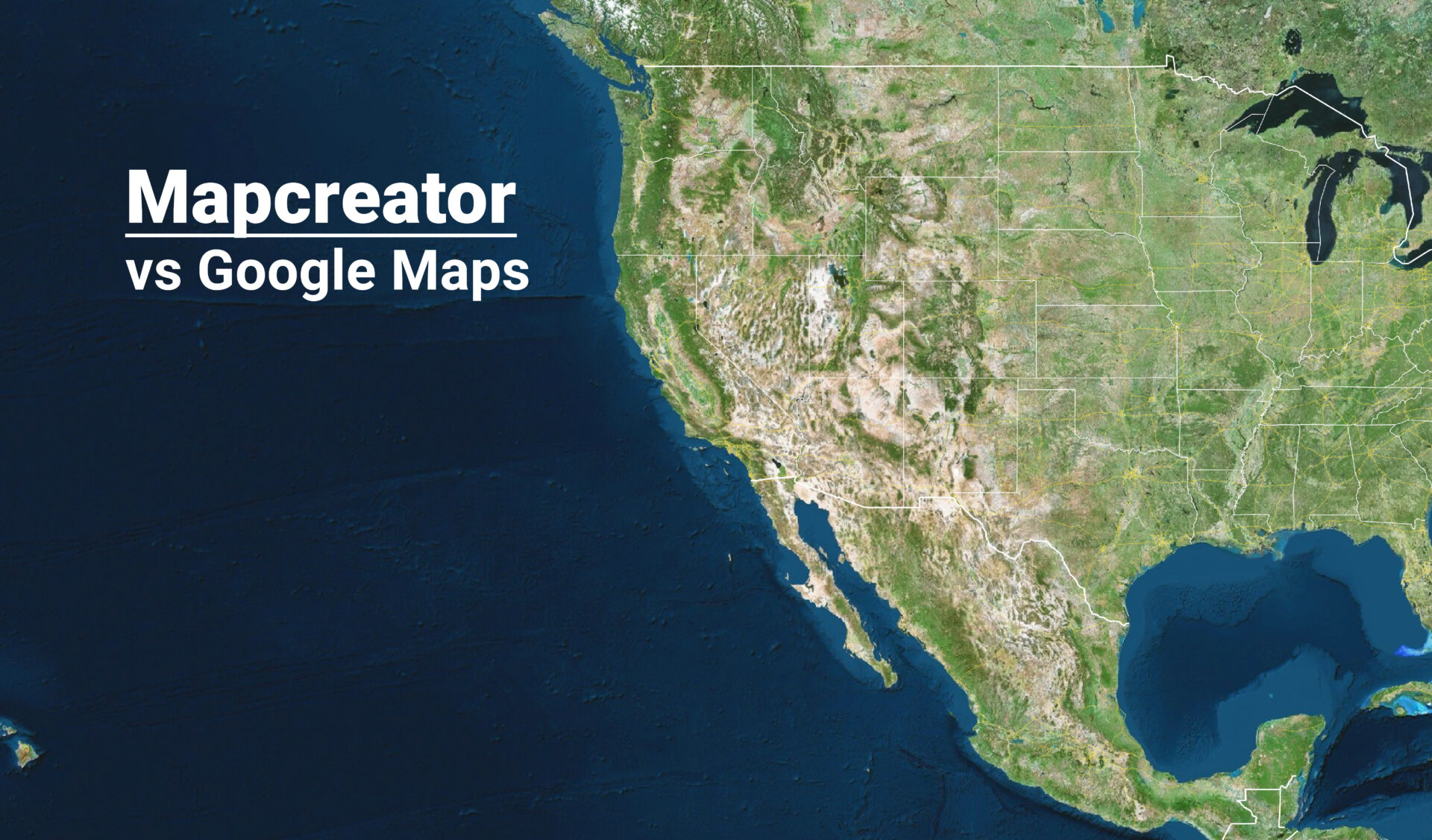
Mapcreator, the alternative to Google Maps
When it comes to mapping solutions, Google Maps is an excellent navigation tool. But when it comes to a full...
Read more