Reuters – US election map 2020
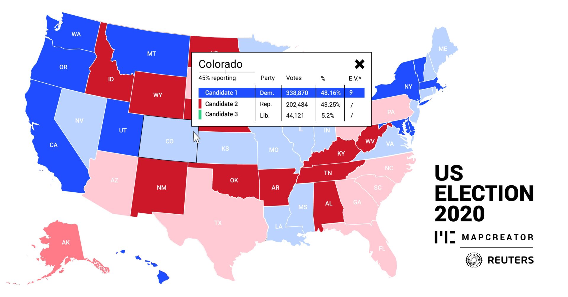
The image is a US Election 2020 map from Mapcreator with data from Reuters, illustrating the United States’ presidential election results. The map uses colors to distinguish states by party: red for Republican, blue for Democratic. Each state is labeled, and a notable detail includes specific results for Colorado that provide numerical data for candidate performance in this state.
As this is a screenshot of an interactive choropleth map, information is made visible while viewers click on or hover over certain states, then visualizing the results for this specific state in percentages. State abbreviations are added on the map, but full state names are visible in the pop up when hovered over.
This map is made with live data, meaning it was continuously updated providing the most up-to-date possible status on the 2020 US election results.
