ACBJ – Food retailers in Buffalo Niagara

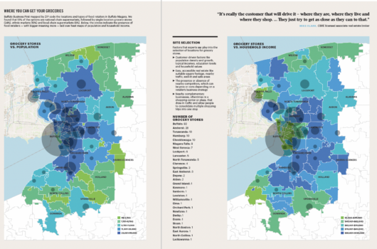
As seen in the map above, it is shown that 57% of the options are national chain supermarkets, followed by single-location grocery stores (24%), ethnic markets (19%) and local chain supermarkets (0%) Below the circles indicate the presence of food retailers with bigger meaning more laid over heat maps of population and household income.
The map includes labels such as ”Holland”, ”Buffalo”, ”Akron”, ”Alabama”, ”Lockport” and ”Wilson” among others.
A legend can be found on the bottom right of both maps, further explaining the coloring of the choropleth map per population or household income.
