Maps for elections
Create live, interactive, and broadcast-ready election maps with Mapcreator. Trusted by major networks like BBC, SKY News Australia, TVA, and Amazon Prime, our mapping tool brings accuracy, flexibility, and speed to election coverage around the world.











Built for election coverage
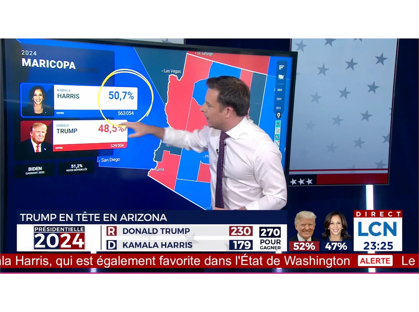
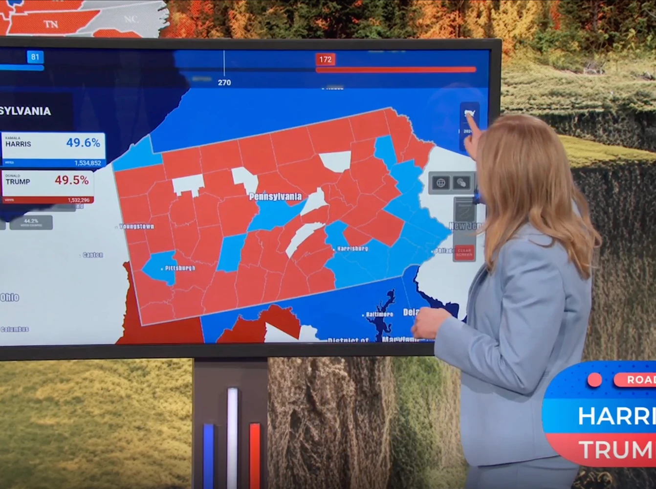
Show developments as votes come in with live-updating maps that refresh automatically every 10 seconds. Use touchscreen presentations for on-air analysis, embed interactive maps online, or project them onto the studio floor for a new visual dimension. For accessibility, our AI-powered voice assistant provides clear spoken election updates and map descriptions, helping color-blind and blind users follow results in real time.
Interactive and data-driven
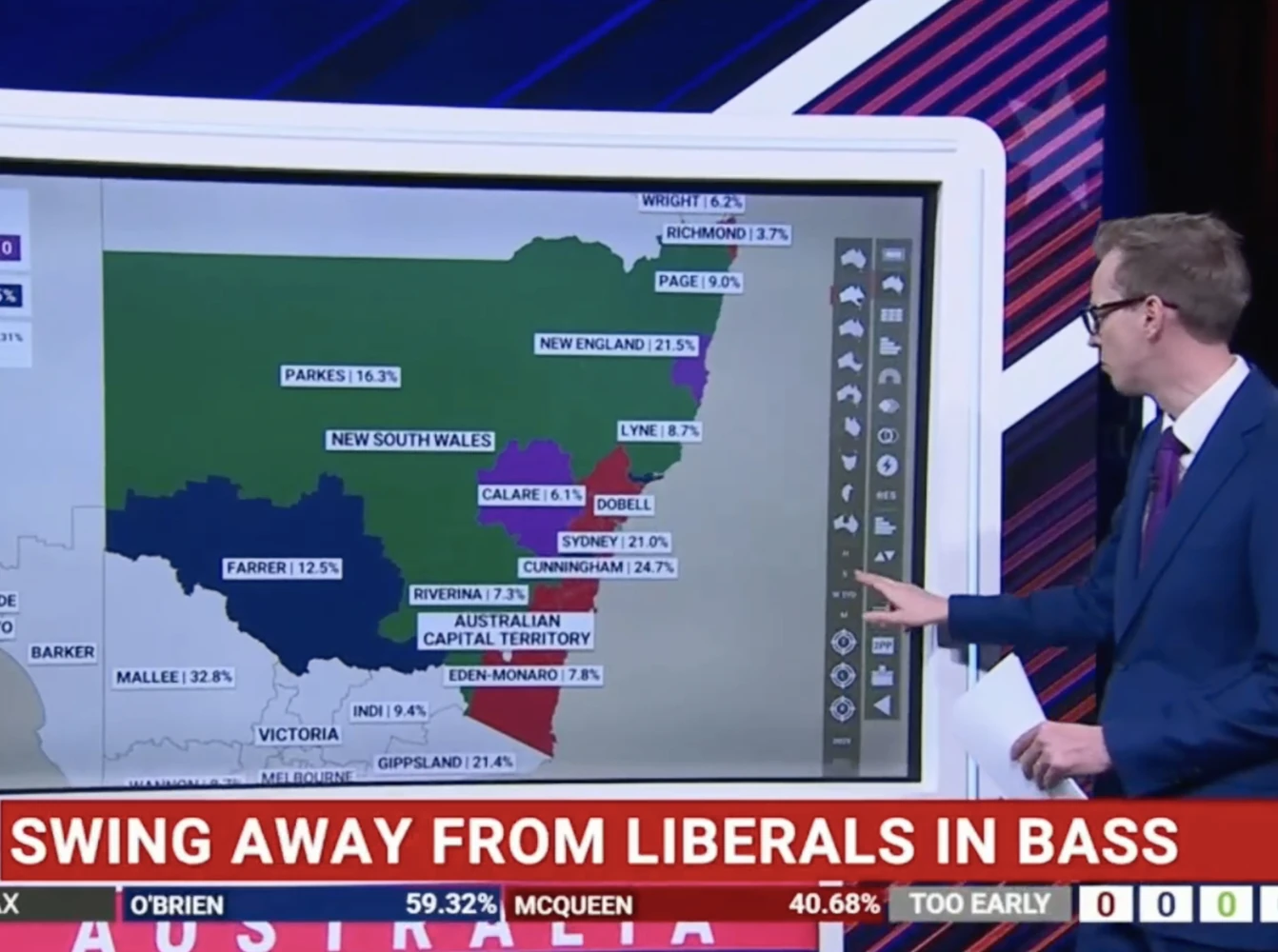
Connect your maps to reliable data feeds or use your own datasets. Visualize results by country, region, or district with flexible map types like choropleths and tilegrams. Add interactivity with popups showing candidate details and vote breakdowns.
Broadcast-ready maps for election night
Customize every map with your network’s colors, fonts, and graphics for a consistent, highly recognizable look. Our maps are built for studio-wide readiness, making it easy for teams across broadcast, digital, and print to collaborate seamlessly. And if you need support, our design team can adapt your visual identity to match any format, from high-resolution print to live on-air graphics.
See it in action
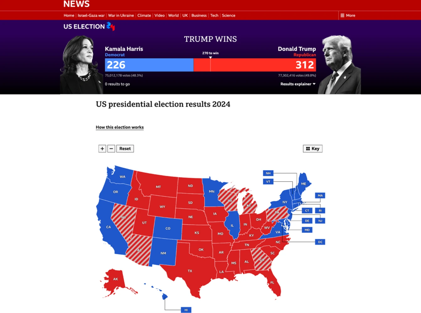
From the US to Canada to Australia, Mapcreator has powered election coverage for BBC, TVA, SKY News, and Amazon Prime. Whether on air, online, or in the newsroom, Mapcreator delivers clarity when it matters most.
Map smarter now.
No spam, just high-quality mapping insights. Unsubscribe anytime.
Frequently asked questions
Got a question? Start with these essential FAQs, or explore our Knowledge Base for more Mapcreator guidance.
Can Mapcreator create live election maps?
Yes. Mapcreator can help teams create live, interactive, and broadcast-ready election maps for their election night live coverage, for on-air and digital stories. Visualizing results on a map supports your audiences in quickly understanding which areas are reporting, leading, or swinging.
Can I use our own election data?
Yes. You can import your own election data and connect it to map areas, colors, labels, and popups. This makes it possible to show results by region, district, constituency, municipality, ridings, or other electoral boundaries.
Can election maps be used for broadcast and online coverage?
Yes. Election maps can be prepared for broadcast graphics, embedded online as interactive maps, exported as static visuals, or animated for explainers and live segments. This helps teams keep election coverage consistent across TV, web, social, and internal workflows.
Can Mapcreator match our election branding?
Yes. Election maps can be styled with your organization’s colors, fonts, labels, legends, and party or candidate color schemes. This helps every map stay clear, recognizable, and aligned with the rest of your election coverage.