Lee Enterprises – Share of medial debt
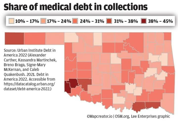
The image is a choropleth color-coded map of Oklahoma, illustrating the percentage of medical debt in collections across the state’s counties. Various shades of red highlight the medical debt levels, with darker shades representing higher percentages and lighter shades signifying lower percentages.
The map’s title, “Share of medical debt in collections,” is prominently displayed. A scale is provided to interpret the color coding, which indicates percentages ranging from 10% to 45%. The map’s data source is the Urban Institute Debt in America 2022.
