Blog

Discover the magic of maps and get inspired – Learn more and get a deeper understanding of maps and their significance.
Are you looking for best practices, tips, updates and helpful hints to make your maps stand out? You came to the right place!

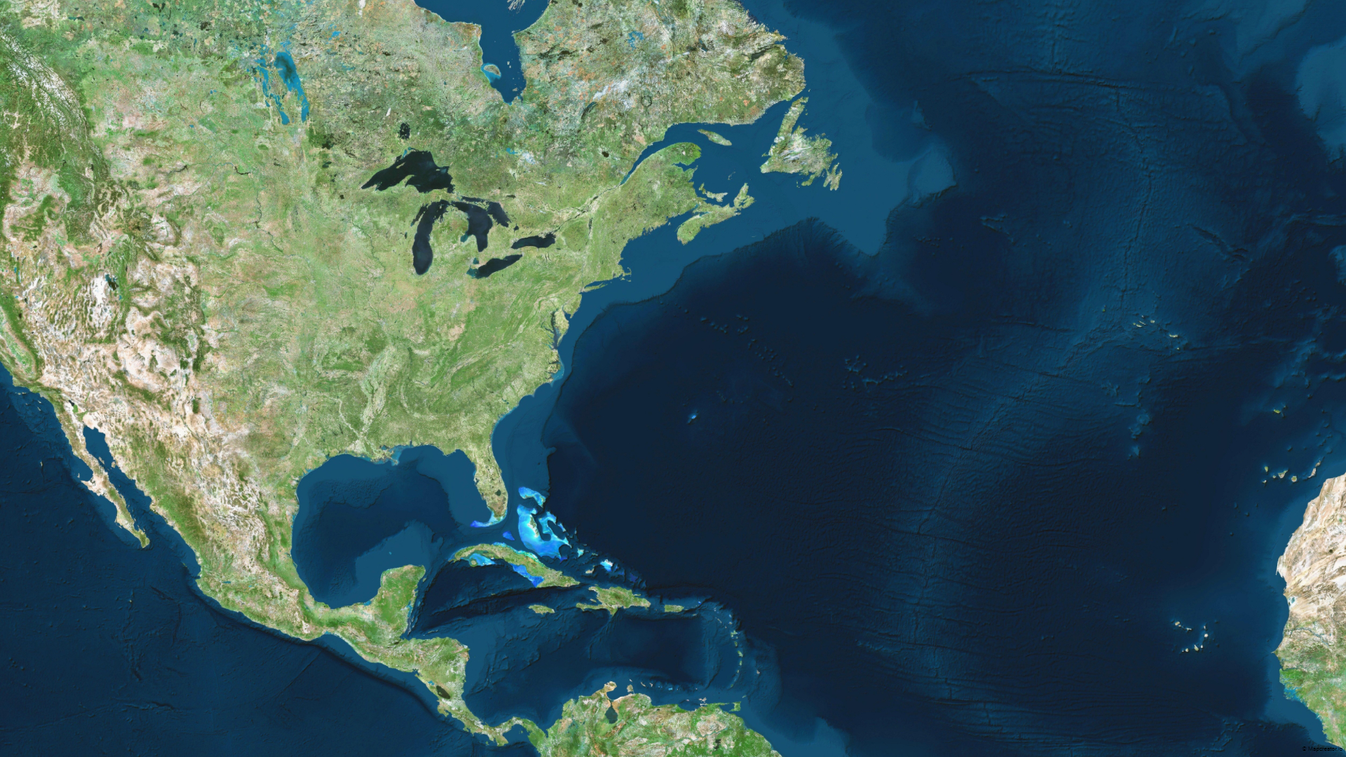
Visualize your story with satellite imagery from HERE Technologies

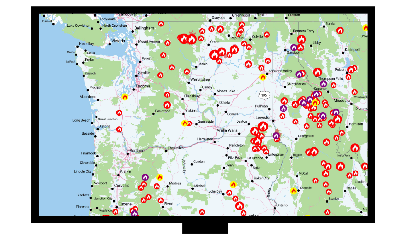
Mapcreator provides a full global base map to our subscribers. Visualize and create maps anywhere in the world with high resolution photorealistic quality. Satellite imagery Mapcreator uses global satellite and aerial imagery provided by HERE Technologies. HERE provides Mapcreator some of the sharpest and up-to-date imagery through a strategic partnership with Maxar. The imagery is […]

Read more
New feature ✨

Making maps of the war in Ukraine

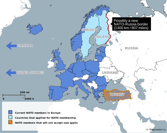
On February 24th the Russian-Ukrainian war began. A horrific conflict. The war changed journalism from that day on. Journalists are on high alert to cover all news about the war. In the journalism landscape, the making of maps became more important, because how many people know where Ukraine lies? And what major cities are being […]

Read more

Getting Rid of Spaghetti Road Networks 

Have you ever wondered how mapmakers choose which roads to draw and which ones to leave out of a map? Back in the day, cartographers manually decided which roads were important at the to-be-mapped scale. At relatively small scales, like a map of the entirety of the United States (1:50.000.000), the great majority of the […]

Read more
New feature ✨

Distance rings

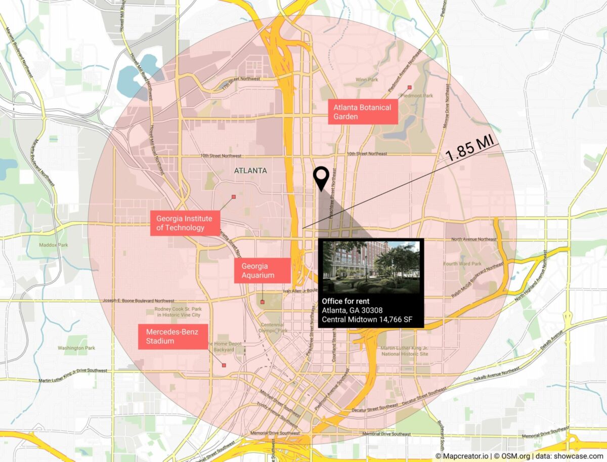
We released our new Distance rings update, which rolls out the ability to draw circles from a center point with a specified distance, either in miles, kilometers, or nautical miles! You’re a commercial realtor – how do you show attractions within a certain distance of your property?   Or you’re reporting government policy and you need […]

Read more

Behind the scenes of a data-driven article and visualization

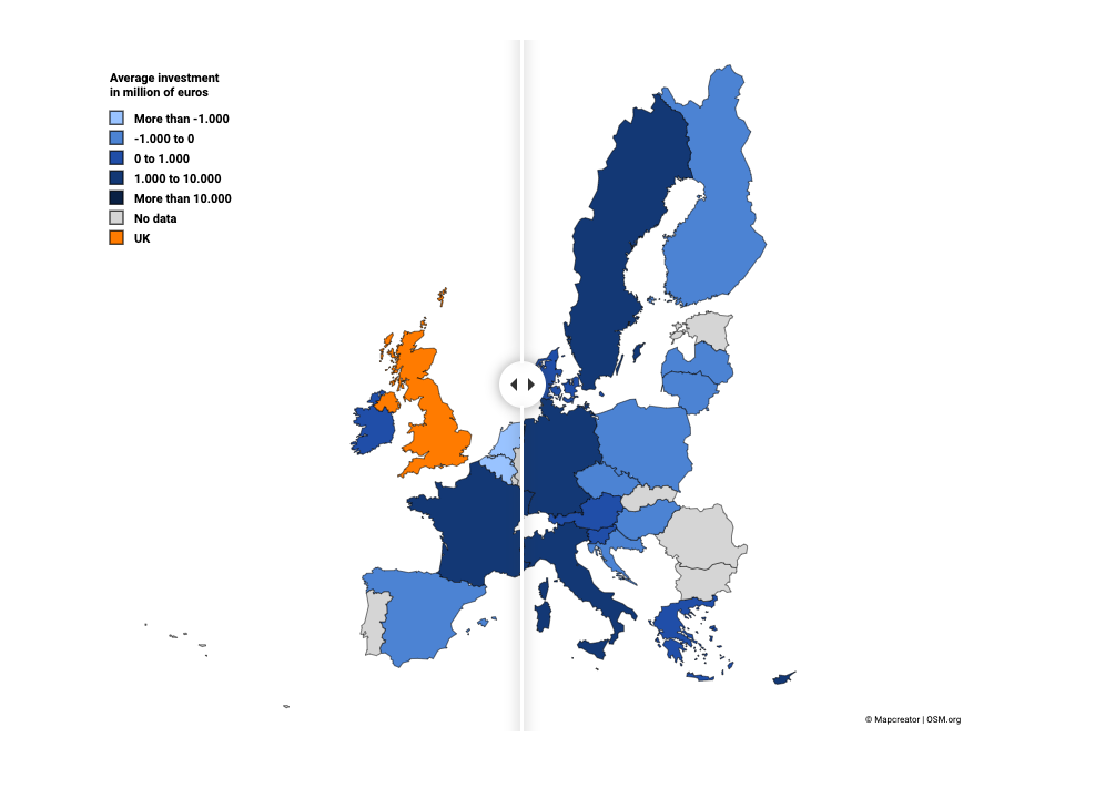
Article by DataBewijst We are DataBewijst: a Dutch data journalism company. The company was founded by four young journalists who have a passion for telling data-driven stories. And what better way to tell a story is there than visualizing it? We wanted to collaborate with Mapcreator because visualizing your data is one of the most […]

Read more

Canadian elections 2021 map

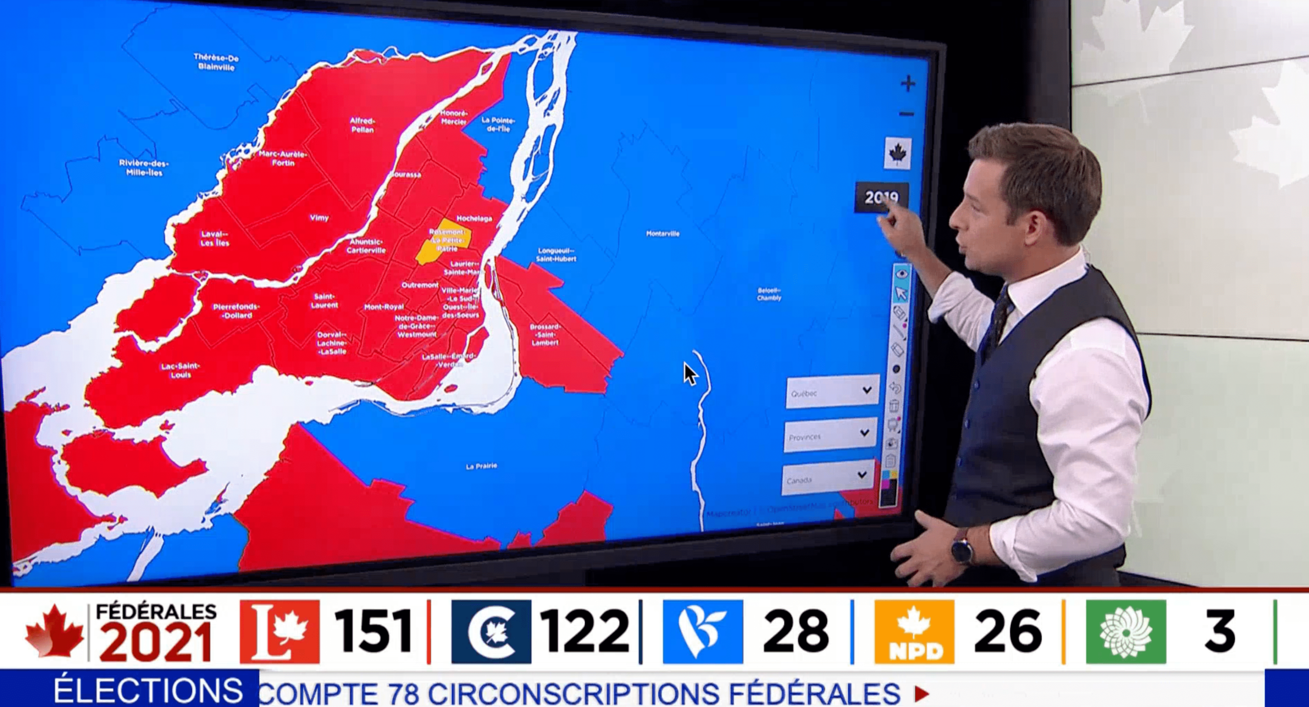
Last week Mapcreator exclusively partnered with Canadian television network TVA. We published live updates on an interactive map which was presented on their news shows. Canada is divided into 338 electoral districts called ridings. Per “first-past-the-post” system, the candidate who receives the most votes per district becomes their Member of Parliament (MP) and represents the riding in the House […]

Read more

GEOlayers compatibility – Maps aren’t static anymore

Today, Mapcreator announces compatibility with the powerful GEOlayers Adobe After Effects extension.  The world loves maps. We see them everyday – in print, online, and on television. For years, mapmakers and cartographers created works of geographic art and visualization as images and interactive dashboards. Mapmaking made a jump from static representations to one that includes […]

Read more

Maps for local news

by Hassân Al Mohtasib If there is only one thing I’ve learned while working for a local/regional newspaper about cartography, it would be this: readers love maps. You can’t afford to be stingy with them. Local newspapers report on those well-known other stories that national broadsheets or even highbrow weeklies don’t. They speak about a […]

Read more

Mapping the U.S. election with live data from Reuters

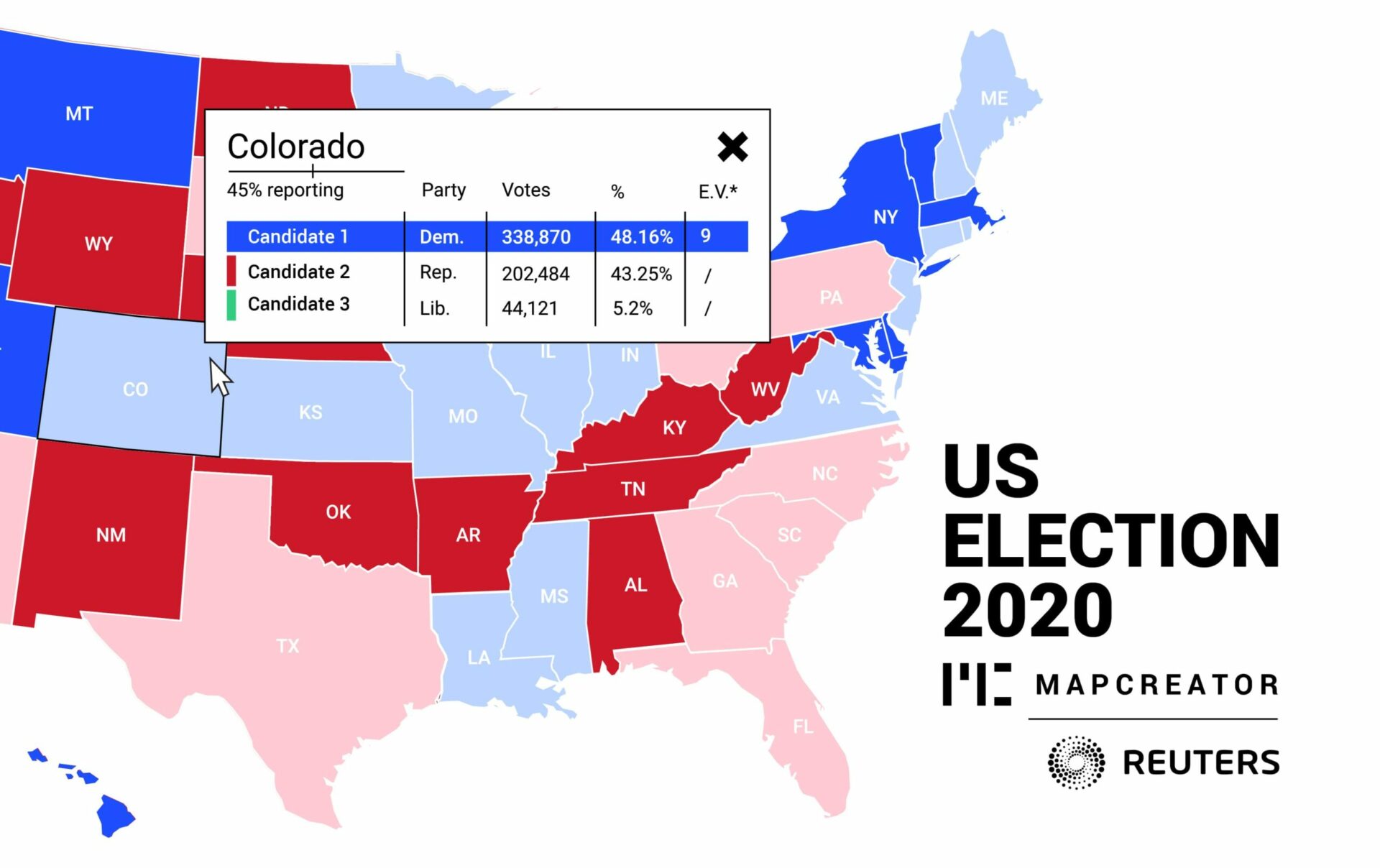
Mapcreator today announced a new partnership with Reuters to allow users of the Mapcreator tool to subscribe to Reuters live U.S. election data feed. The Reuters feed is powered by election data from Edison Research and the National Election Pool (NEP) with the partnership allowing Mapcreator customers around the world to deliver a real-time vote count […]

Read more

Mapcreator: the two-minute map

They say that behind every success is a great team. At Mapcreator, we couldn’t agree more. At the heart of our service is the Mapcreator tool, which enables newsrooms, corporates and brands from around the world to create quality maps, quickly and easily. Technology never stands still; so how do we ensure that the Mapcreator […]

Read more

Mapping impact 

by Frederik Ruys A short guide to visual storytelling With an explosive amount of data and the insatiable need for visualizations it can be hard to find the best tool to share your story. But besides the proper tool, it’s also about the correct approach. How do you map impact with your data in our […]

Read more

Baking the map layer cake

by Maarten Lambrechts Almost all mapmaking tools with a graphical user interface use map layers to manage the content of the map. The source of the layers can be very diverse: they can come from the local computer or from a remote source, they can contain raster sources or vector source layers. But every layer […]

Read more

Podcast : The state of maps in the news media industry

Podcast : The state of maps in the news media industry Christian Erades from Mapcreator joined the newest edition of the Mapscaping podcast to talk about the importance and use of maps in the news media industries. The Mapscaping podcast is a podcast series for the geospatial community and everyone who loves maps. In this […]

Read more

Mapcreator: one brand, one vision

We have some exciting news to share with you! Actually, we have lots of exciting stuff to tell you about over the coming months but, for now, let’s start with our new, err, old name. As you know, we are mad on, gaga about and positively crazy for maps. We can’t help it, mapping is […]

Read more

This content is available in English

Would you like to switch?

Diese Inhalte gibt's auch auf Deutsch

Möchtest du wechseln?

Contenu disponible en français

Changer de langue ?

Esta página está disponible en español

¿Te gustaría cambiar?

Deze pagina is ook beschikbaar in het Nederlands

Zullen we je doorverwijzen?